How to Choose Colours for Your Newborn Photography Session
What colours feel like your family?
The right colour palette can help your newborn portraits feel personal, thoughtful and at home in your space. You might love soft neutrals, fresh garden greens, warm golden tones or a little pop of pink and blue. There is no single “right” palette. The best one is the combination that makes you smile.
At Buttons & Bows Photography, we style each newborn session around your preferences. Our Springfield Lakes studio welcomes families from Ipswich, Brisbane and across South East Queensland. To make choosing easier, we have created 25 coordinated colour palettes to give you ideas before your session.
Browse the palettes below and note the names or numbers that catch your eye. You can choose one, combine ideas from two, or use them as a starting point for a palette of your own.
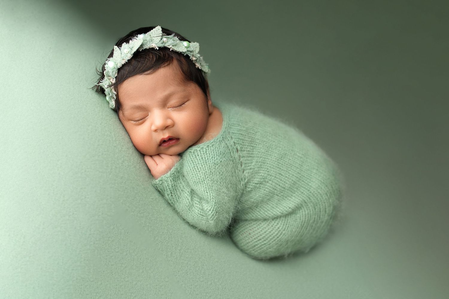
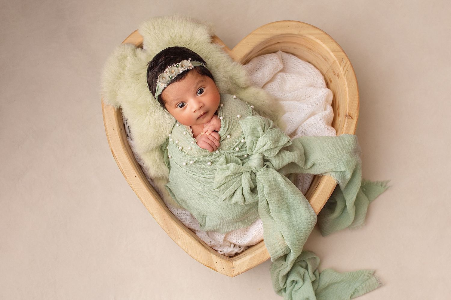
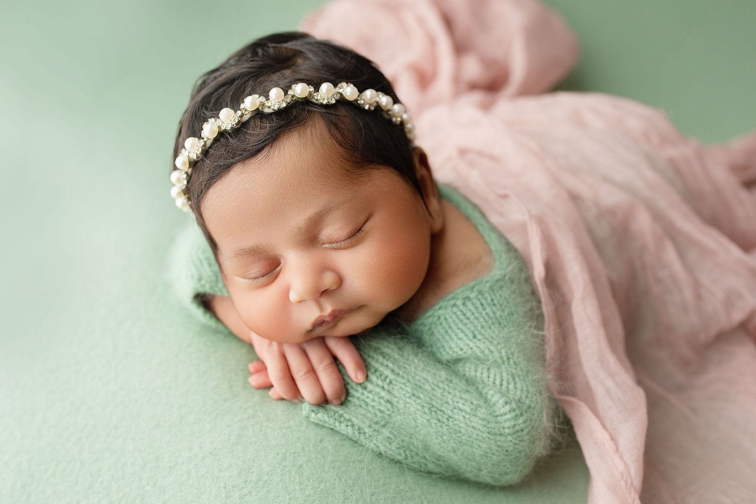
How to choose a newborn photo colour palette
Think about where you will display your portraits
If you are planning to hang your newborn photos in a particular room, take a look at the colours in that space. You might want your portraits to sit quietly alongside your décor, or you may prefer a little colour that draws the eye.
Choose a feeling, not just a colour
Do you picture something calm and timeless? Soft and romantic? Bright and playful? A palette can include several different colours while still feeling balanced. For example, pink can sit beautifully with yellow, cream and sage, while blue can pair with lavender, blush and soft grey.
Consider what your family will wear
Once you have chosen your palette, select two or three tones from it to guide your family’s outfits. You do not need to wear every colour. Choosing a few complementary tones helps everyone look coordinated while still feeling natural and comfortable.
If you prefer neutral clothing for your family portraits, you can add a subtle accessory in one of the palette’s contrasting tones. A hair bow, headband, cardigan or tie can bring in a soft touch of colour without overpowering the portraits.
Tell us what you love and what you would rather avoid
Your palette is a guide for planning the session. Let us know if there is a colour you especially love, a tone you would prefer not to use, or a meaningful item you would like us to include. We will use your preferences to guide the wraps, backdrops and props we prepare.
explore & Choose your palette
Please choose one palette as your preferred colour direction for your newborn session. Send us its name or number, along with any colours you would prefer us to avoid. We will use your choice to guide the wraps, backdrops, props and outfit suggestions for your session.
If you are preparing for your session, you can also visit our newborn photography page or get in touch with Salma to talk through your ideas.
We look forward to creating something beautiful for your family.
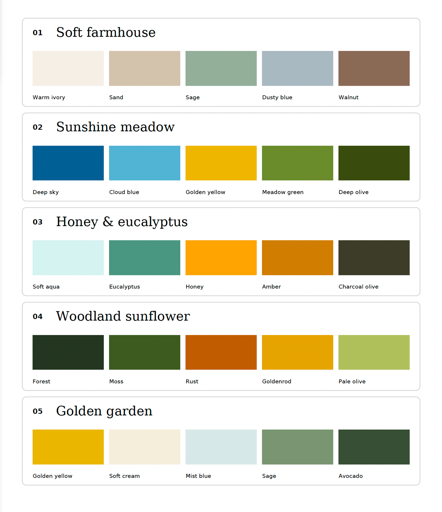
01. Soft Farmhouse
Calm, relaxed and timeless, this palette suits a light filled nursery with natural timber, soft furnishings and a simple, lived in feel.
02. Sunshine Meadow
Fresh and cheerful, this palette brings brightness to your portraits. It suits a sunny nursery with botanical touches or an open, light filled home.
03. Honey & Eucalyptus
Warm and fresh at the same time, this palette complements a relaxed home with natural textures, greenery and a touch of colour.
04. Woodland Sunflower
Rich and expressive, this palette has a cosy woodland feel. It suits a nature inspired nursery, darker timber or a more dramatic interior style.
05. Golden Garden
Soft, sunny and welcoming, this palette works well in a light filled nursery or a home with a relaxed, natural style.
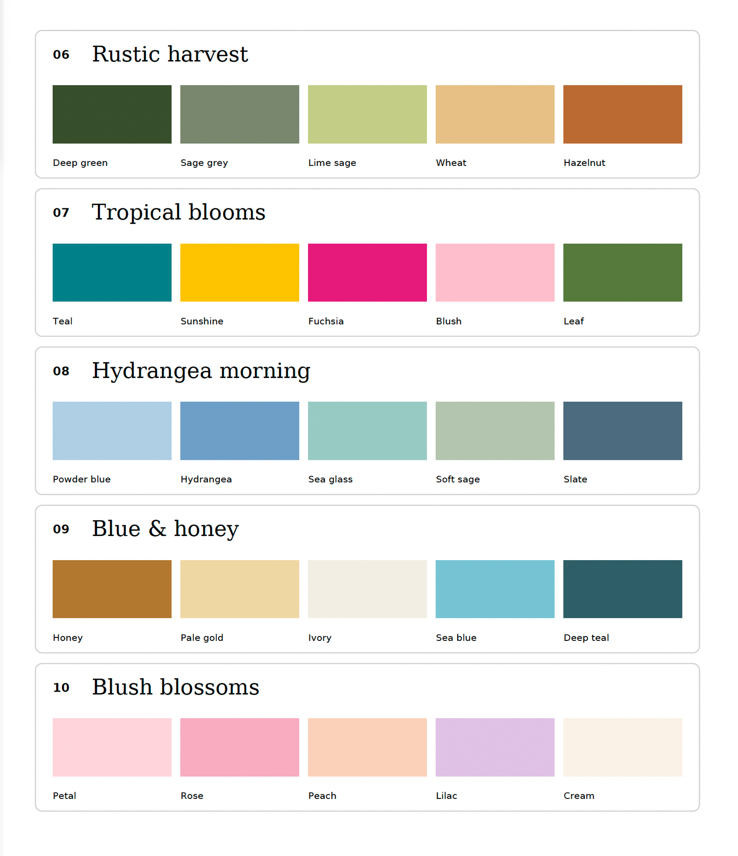
06. Rustic Harvest
Warm and grounded, this palette brings a cosy country feel to portraits. It works beautifully with timber furniture, woven textures and earthy details.
07. Tropical Blooms
Bright, playful and full of personality, this palette suits a colourful nursery or a home with bold details and a creative feel.
08. Hydrangea Morning
Calm and airy, this palette feels like a peaceful morning in the garden. It suits a bright nursery or a home with a relaxed, coastal feel.
09. Blue & Honey
Balancing a fresh feeling with cosy warmth, this palette suits a home with natural timber, soft blue details and a welcoming style.
10. Blush Blossoms
Delicate and romantic, this palette has a soft floral feeling. It suits a nursery with gentle decorative details or a home with a light, feminine touch.
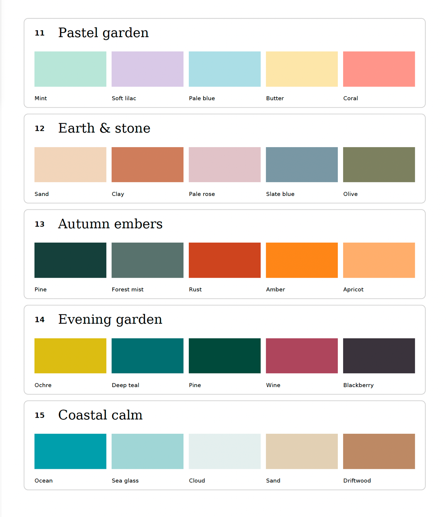
11. Pastel Garden
Light and playful, this palette feels sweet without being too formal. It suits a cheerful nursery or a bright family home.
12. Earth & Stone
Gentle and understated, this palette has a natural, modern feel. It sits comfortably in a home with muted walls, stone textures and simple furnishings.
13. Autumn Embers
Warm and cosy with a hint of drama, this palette suits a home with timber, warm lighting and layered details.
14. Evening Garden
Moody and elegant, this palette makes a striking statement while still feeling refined. It complements deeper wall colours, rich furnishings or a dramatic nursery.
15. Coastal Calm
Relaxed and breezy, this palette brings a gentle coastal feeling to your portraits. It complements light interiors and natural textures.
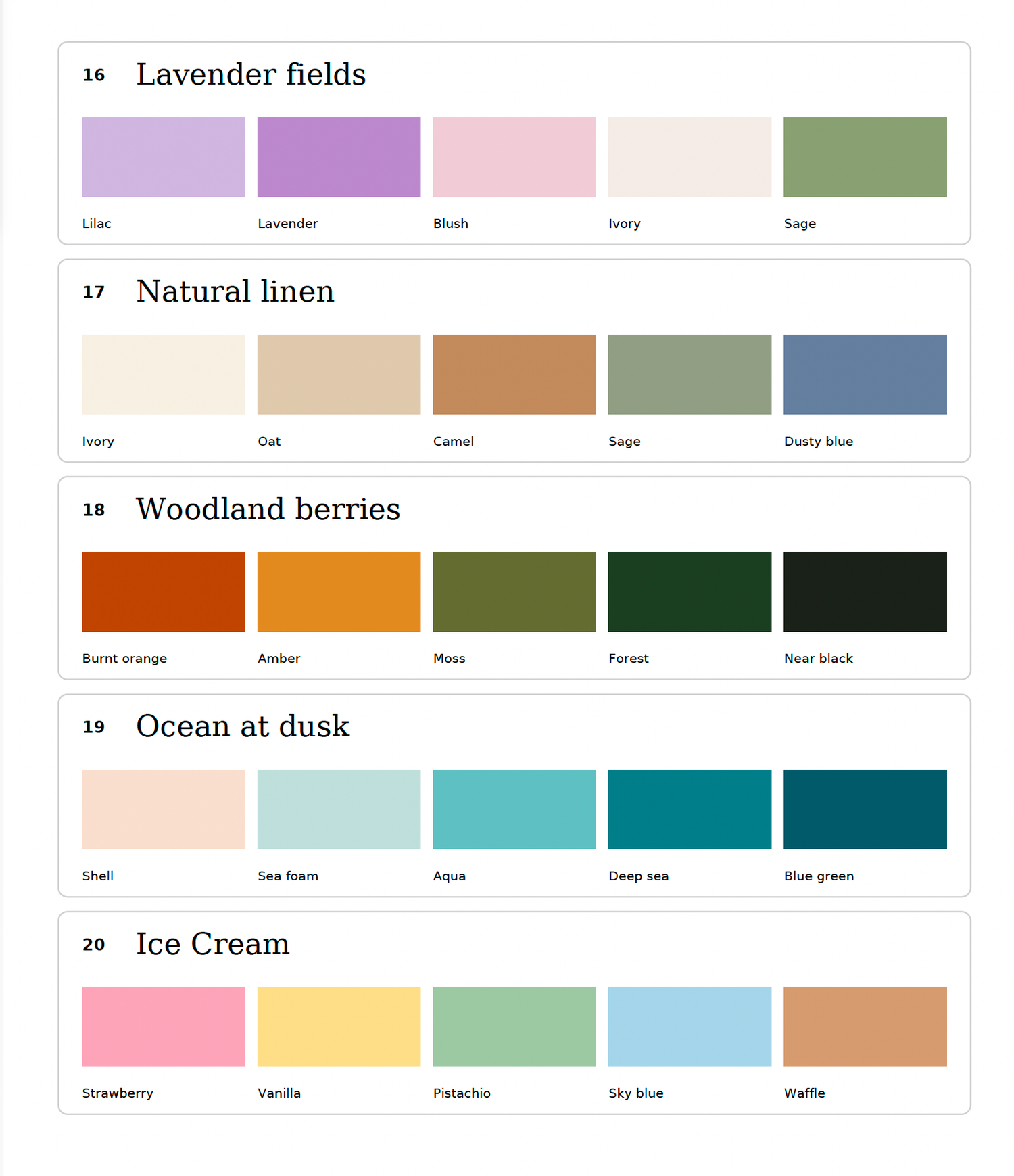
16. Lavender Fields
Gentle and dreamy, this palette brings a peaceful floral mood to your portraits. It suits a soft, romantic nursery or a calm home with classic details.
17. Natural Linen
Soft and quietly elegant, this palette feels effortless and classic. It suits a neutral nursery or a home styled with natural fabrics and light timber.
18. Woodland Berries
Warm, rich and full of character, this palette suits a nature inspired nursery or a home with earthy, collected details.
19. Ocean at Dusk
Peaceful and atmospheric, this palette suits a coastal home with deeper accents or a calm, modern nursery.
20. Ice Cream
Sweet, fresh and cheerful, this palette has a playful feel while staying soft. It suits a bright nursery or a relaxed home with a few fun details.
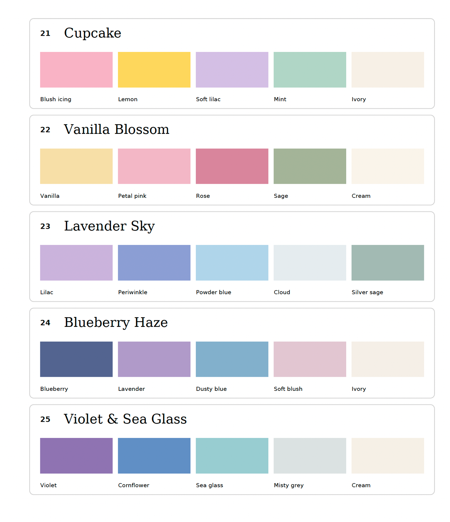
21. Cupcake
Pretty and lighthearted, this palette feels like a gentle celebration. It suits a soft pastel nursery or a home with cheerful, delicate styling.
22. Vanilla Blossom
Warm, soft and romantic, this palette feels timeless with a hint of floral charm. It suits a light, classic nursery or a home with gentle, natural styling.
23. Lavender Sky
Dreamy and peaceful, this palette feels soft and airy. It suits a calm nursery with gentle details or a home styled in a relaxed, contemporary way.
24. Blueberry Haze
Softly moody and distinctive, this palette has a modern, refined feel. It complements a nursery with deeper accents or a home with muted, layered décor.
25. Violet & Sea Glass
Fresh and graceful, this palette feels calming with a little colour. It suits a bright nursery or a home with modern furnishings and soft decorative details.
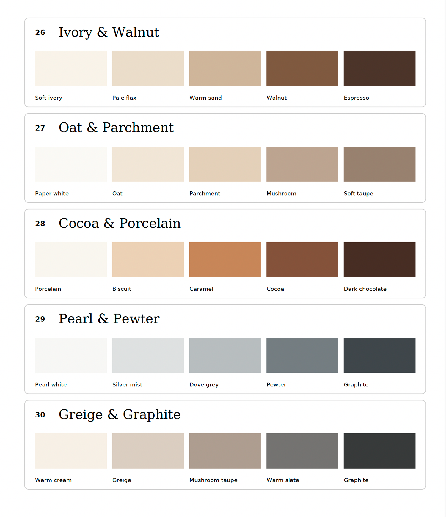
26. Ivory & Walnut
Warm and refined, this palette pairs a soft, light feeling with rich timber tones. It suits a neutral nursery with natural wood details.
27. Oat & Parchment
Soft, tonal and restful, this palette is lovely for a calm nursery or home with natural textures and gentle neutral décor.
28. Cocoa & Porcelain
Bold yet classic, this palette brings contrast and warmth to portraits. It suits a light room with darker timber or chocolate toned accents.
29. Pearl & Pewter
Cool and contemporary, this palette works beautifully in a bright nursery or a modern home with clean, understated styling.
30. Greige & Graphite
A warmer take on grey, this palette feels polished and grounded. It suits a home with soft neutral décor and a few dark accents.

31. Cotton & Sky
Fresh and airy, this palette suits a bright nursery or a home with clean lines and soft, natural details.
32. Blue Linen
Relaxed and timeless, it pairs beautifully with a calm coastal home, natural timber and soft furnishings.
33. Clean Coastal
Crisp and serene, this palette suits an open, light filled nursery or a home with uncluttered seaside styling.
34. Bluebell Morning
Gentle and dreamy, it complements a peaceful nursery or a softly styled home with delicate details.
35. Denim & Oat
Casual yet classic, this palette works well in a relaxed family home with natural textures and comfortable furnishings.
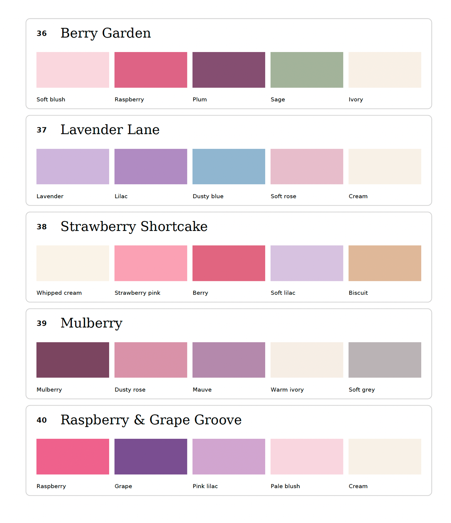
36. Berry Garden
Romantic and full of depth, this palette suits a floral nursery or a softly styled home with botanical details.
37. Lavender Lane
Dreamy and peaceful, it would feel at home in a light, calm nursery or a bedroom with gentle, relaxed styling.
38. Strawberry Shortcake
Sweet and playful with a nostalgic feel, this palette suits a cheerful nursery with soft, whimsical details.
39. Mulberry
Rich and elegant, it complements a more grown up nursery or a home with muted décor and warm timber.
40. Raspberry & Grape Groove
Expressive and vibrant, this palette suits a modern, colourful nursery or a creative home with playful accents.
Choosing wall art to suit your colour palette
Your chosen palette helps guide the styling of your newborn session, and it can also give you ideas for your finished wall art. The palette does not need to dictate the artwork finish. Think about the feeling you want the portrait to have and where you plan to display it.
wood
Rustic wood brings warmth and natural character to a portrait. It pairs especially well with earthy and timeless palettes such as Soft Farmhouse, Woodland Sunflower, Rustic Harvest, Natural Linen, Ivory & Walnut and Cocoa & Porcelain. It can look beautiful in homes with timber furniture, natural textures and a relaxed style.
metal
Metal has a crisp, polished look that makes colour and detail stand out. It is a lovely choice for more vivid palettes such as Sunshine Meadow, Tropical Blooms, Evening Garden, Ice Cream, Berry Garden and Raspberry & Grape Groove. The clean finish suits contemporary spaces and portraits with a little more colour or contrast.
Acrylic
Acrylic creates a sleek, glossy finish with a sense of depth. It can complement fresh, airy palettes such as Hydrangea Morning, Lavender Sky, Bluebell Morning, Clean Coastal and Violet & Sea Glass. As acrylic has a reflective surface, it is helpful to consider the light and windows in the room where you plan to hang it.
Canvas
Canvas has a softer, textured finish that gives portraits a gentle, classic feel. It pairs beautifully with romantic or muted palettes such as Blush Blossoms, Lavender Fields, Oat & Parchment, Vanilla Blossom and Pearl & Pewter. It suits cosy spaces and homes with a softer, more relaxed style.